Project
Hyperform
Type
Product design, Design systems
Role
Multidisciplinary Designer
Years
2022 - 2023
About
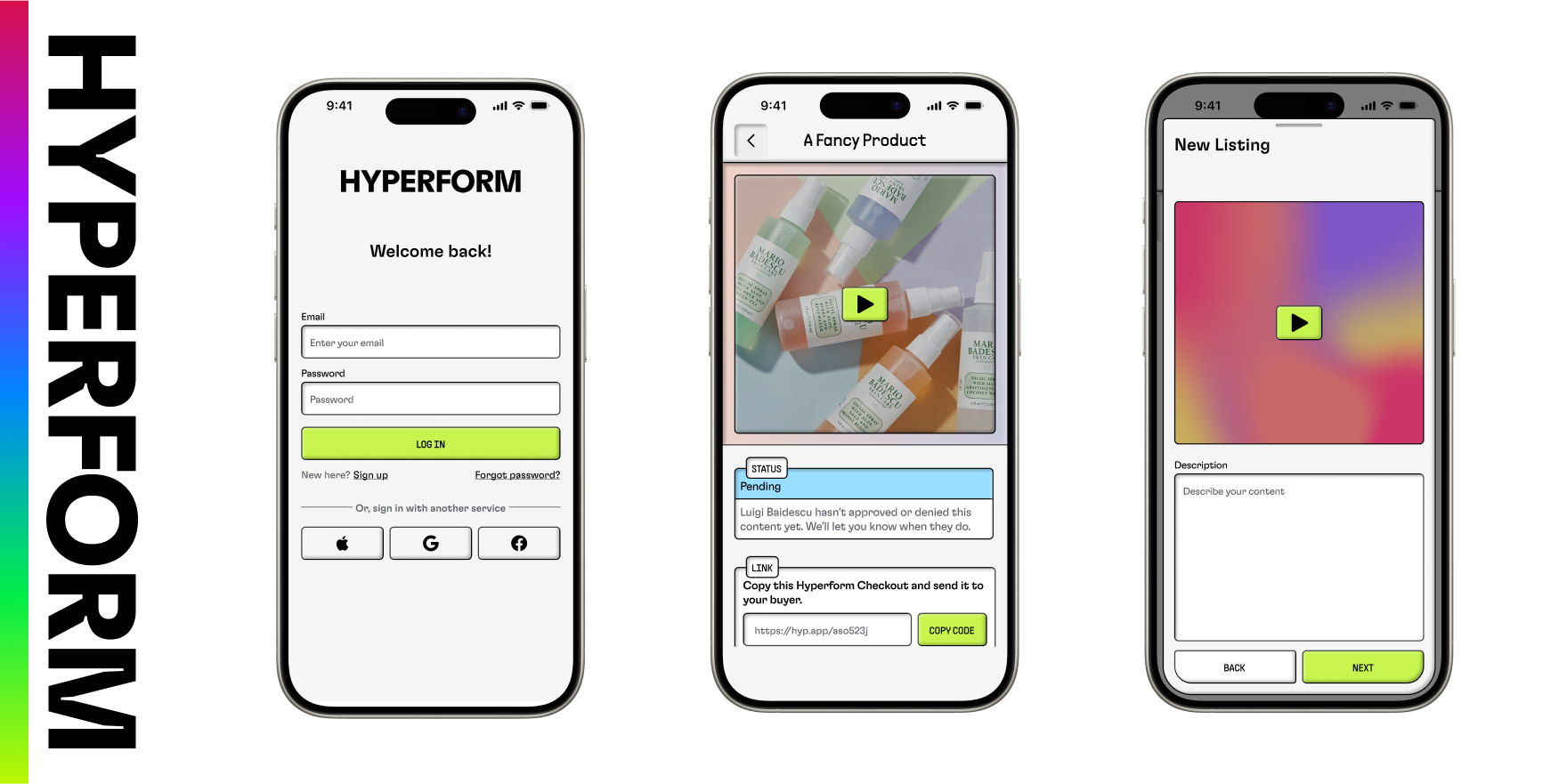
Hyperform is an app that empowers content creators to sell digital content and seamlessly receive payments.
The founder of Hyperform reached out to me directly after being inspired by my work at Replit, seeking freelance assistance. At the time, the app was based on an alpha version with a basic and limiting design template. I took the initiative to develop a refreshed design system that more effectively conveyed the app’s innovative nature.
This new design system was optimized for mobile devices and featured distinctive elements. Key design choices, such as a vibrant lime accent, dynamic shadows and gradients, and interactive 3D effects, helped make the app both unique and enjoyable to use.

Hyperform’s design language is crafted to make a strong first impression. With a minimalist approach, accent colors are strategically used for call-to-action elements.
Interactive features, such as buttons or checkboxes, provide a tactile and responsive experience with an indented style on click, adding a layer of engagement.
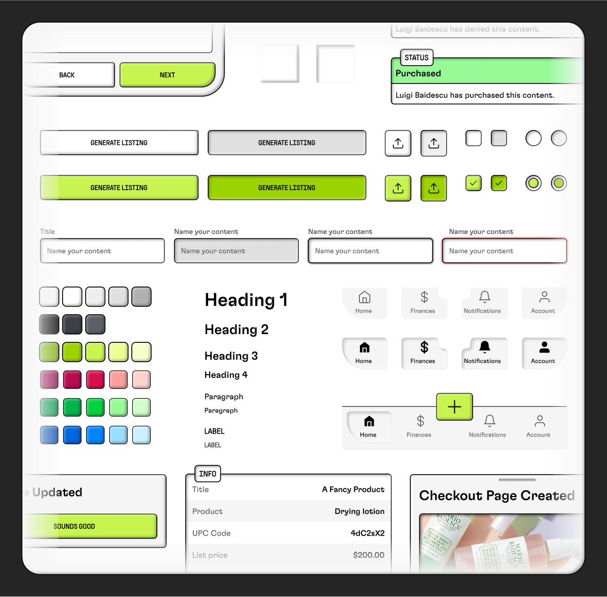
While designing Hyperform’s app, I focused on balancing creativity with functionality. While the vibrant colors were designed to be visually striking, I ensured they met accessibility contrast standards. I also made sure interactive elements had appropriately sized tap targets to maintain usability across all devices.
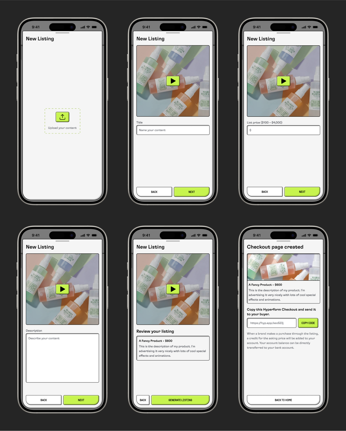
The flow for creating a new listing and completing checkout is in a drawer, providing users with an easy way to exit or return to the flow without losing progress.
The buttons at the bottom of the drawer are designed to mimic the shape of the phone’s frame, making the app feel natively integrated.
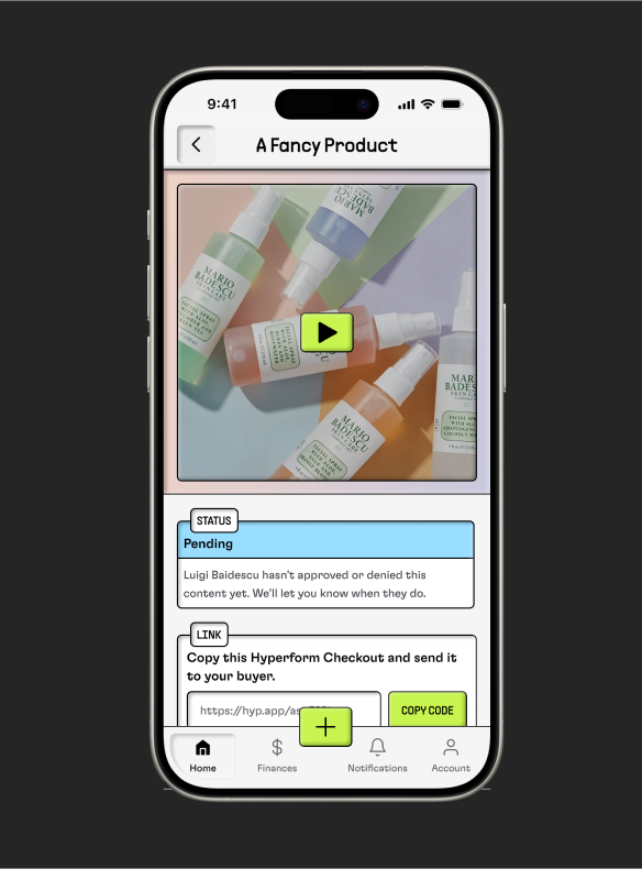
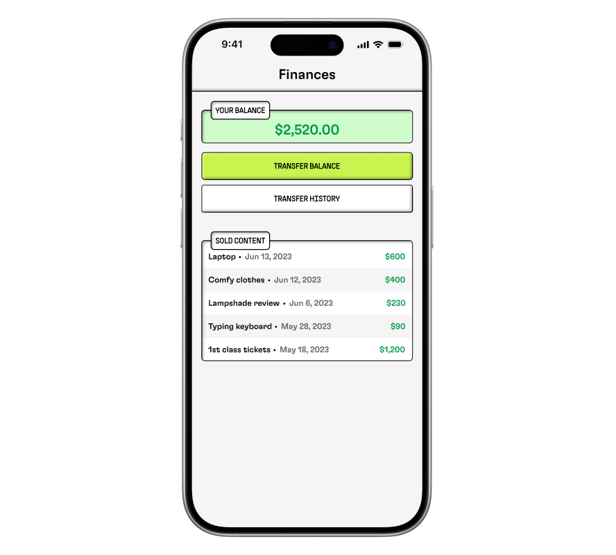
These two screens present important information to users, like video metadata or financial details.
To enhance readability and make the data more digestible, I implemented several design choices. For example, when presenting data in table format, I used alternating row colors to create a visual distinction between entries. Additionally, each section on the screen is clearly labeled with subtly indented headers, helping users quickly understand and navigate the content.