Project
Replit
Type
Product Design, Marketing, Front-end development
Role
Product Design & Marketing Intern
Years
2022 - 2024
About
Replit is an online platform that offers a place for both experienced developers and novices to build, share, and deploy software. Their goal is to empower the next billion software creators.
I joined Replit when I was 15 years old and loved it so much that I worked there for two years, even part-time during high school! My work involved revamping the Replit User Interface (RUI) design system, ensuring every surface received a quality dose of CSS polish. I also built slide decks and other support materials for conferences and presentations.
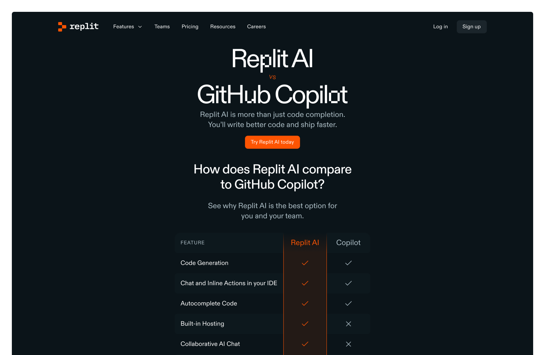
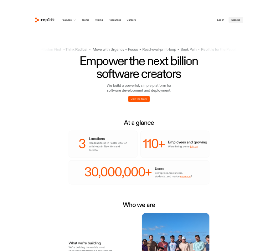
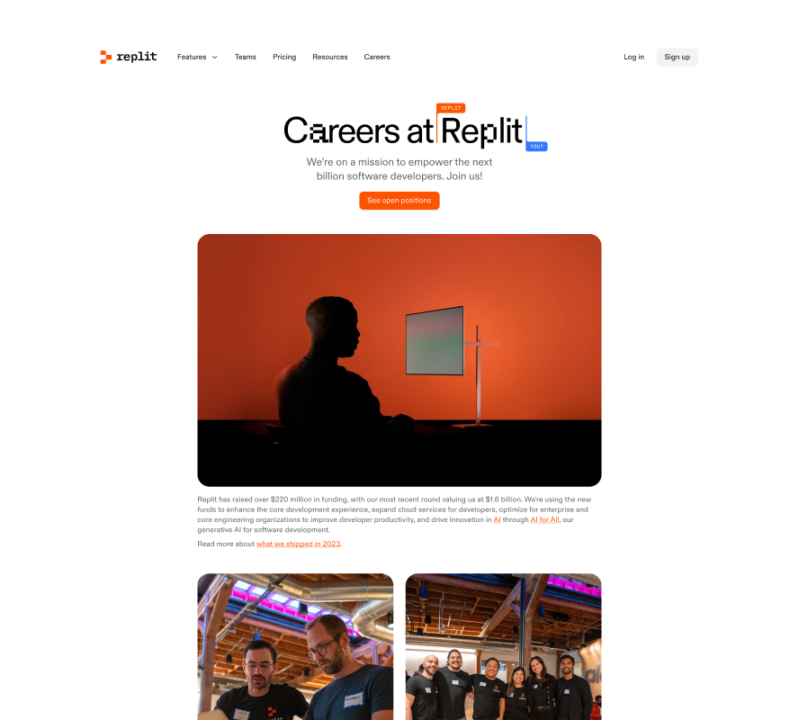
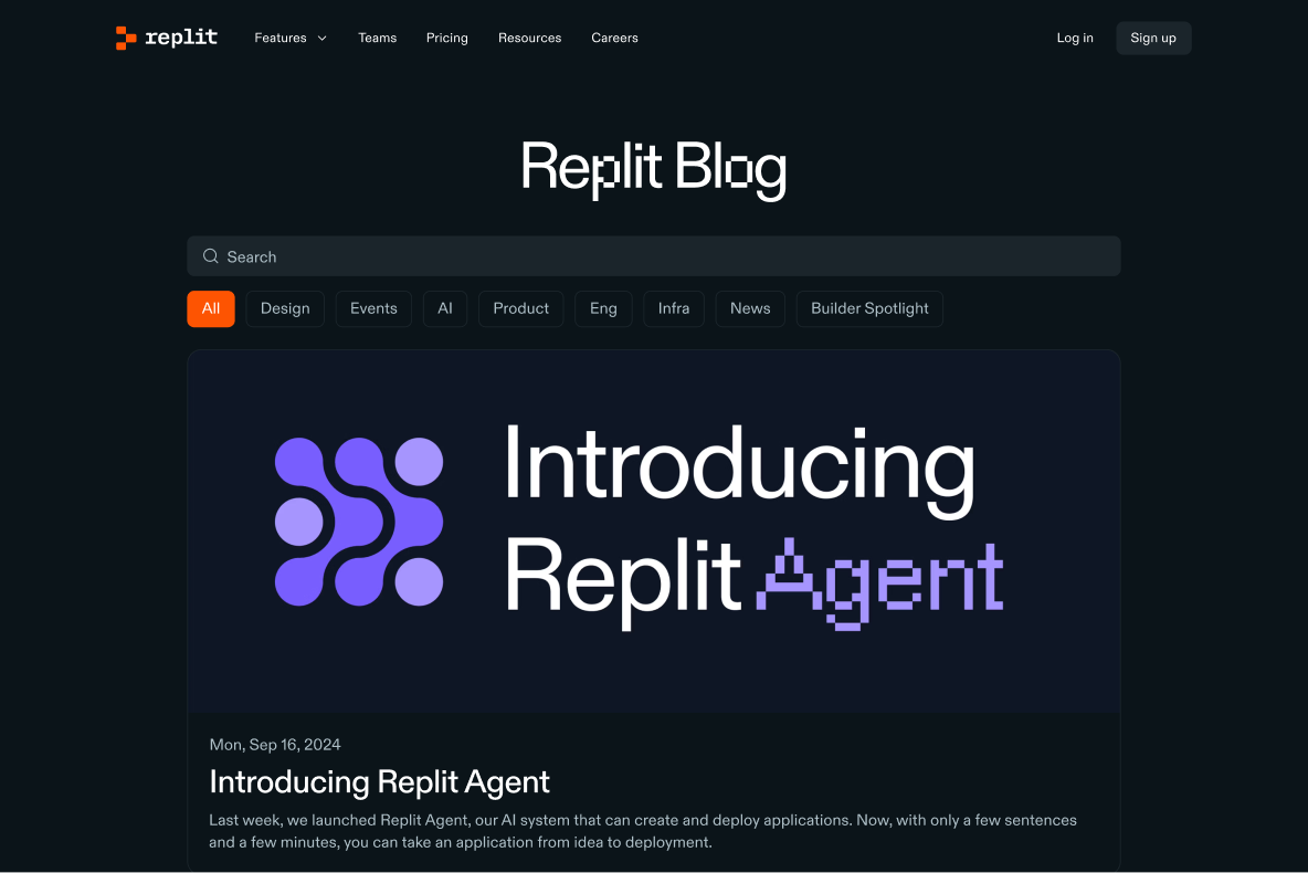
My biggest accomplishment was designing the following marketing pages as part of a company-wide rebrand.

The replit.com/comparison page’s is designed to highlight the advantages of Replit AI over GitHub Copilot. In the hero section, a comparison table provides a clear, side-by-side view of key features, offering an intuitive way for users to quickly grasp the differences. The sections that follow dive deeper, elaborating on what makes each Replit AI feature stand out. Testimonials provide valuable social proof, reinforcing the credibility and effectiveness of the product.


The replit.com/about and replit.com/careers pages are crafted to convey Replit’s mission, culture, and opportunities to both potential users and employees. The About page focuses on Replit’s vision to make software development accessible and impactful, while the Careers page highlights the company’s values and current job openings.
A key aspect of this project was optimizing these marketing pages for search engines. This involved refining the language in the hero section – the first content users see upon landing on the page – and selecting strategic keywords behind the scenes to improve discoverability.

For the Replit blog, I took creative liberties to give this platform a unique, standout feel. For example, I used grid layouts and subtle fading lines to structure the page in a visually striking way. Additionally, I introduced interactive states for the blog cards: a soft shadowy blur that appears on hover, which grows larger when the card is clicked.
To maintain cohesion with Replit’s overall branding, the blog still incorporates key design elements from other marketing pages, such as the signature orange accent color and the consistent use of fonts.